| Surface charts
AWN also produces a wide range of its own surface charts, many updated hourly -- here
- Main
access page for BoM surface charts. Animated loops up to 7
days are available. (21/11/03)
- Australia
- latest surface analysis chart (manual) BoM for 00, 06, 12,
18 UTC. (28/09/02)
- Latest
colour surface analysis chart Bom for 00, 06, 12, 18 UTC,
and an animation of the past
2 days charts. Go here
for an archive, and go to files beginning IDY00030. (04/11/02)
- Australia and Indian Ocean surface
analysis chart for 00
UTC and 12
UTC BoM (05/06/00)
- Southern Pacific Ocean surface analysis
chart for 00
UTC and 12
UTC BoM (05/06/00)
- Archive
of surface charts (manual) for Australia, Indian Ocean and Pacific
Ocean Bom. Currently back to December 1999. (21/11/03)
- Analysis
charts from the US Medium Range Forecast computer model from
COLA. These are the best analysis maps of Australia available
at present. There are six panels giving surface pressure/1000-500hPa
thickness, 850hPa temperature, humidity and winds, 700hPa vertical
velocity, 500hPa height and vorticity, 200hPa (jetstream) winds
and divergence, precipitable water and instability index. (For
detailed descriptions, click here.)
These are based on 00z data, and are usually available by 11z
- check the date to see that they're current, or check their current
status - if they haven't appeared on time! (10/01/00)
- Surface analysis, including weather
depiction, for east Australian coast eastwards to 170W for 0000 | 0600 | 1500 Fijian
time; from Fiji Meteorological Service (10/01/00)
- S Africa to New Zealand - 1000mb analysis & surface
plots by NWS for 00, 12z converted by Georg
Mueller: small or large gif
files (27/05/04)
- New Zealand to South America - 1000mb
analysis & surface plots by NWS for 00, 12z converted by Georg
Mueller:
small or large gif
files. Together with the S Africa to New Zealand chart above, these
give complete coverage of the southern hemisphere. (27/05/04)
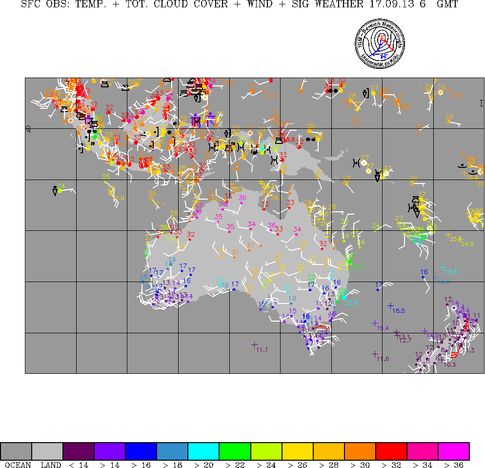
- Synoptic
plots for Australia, NZ, Indonesia. Uni Koeln for 06z. Simplified
plots of temperature, wind, cloud and significant weather. (10/01/00)
Upper air charts
Go here for
help in using these charts
- Australian,
New Zealand and some Antarctic aerological diagrams from the
Bureau of Meteorology. These elegant Skew T diagrams currently
require ID: bomw0007 and PASSWORD: aviation. Large and clear,
they show the latest and previous temperature and dewpoint traces
and winds. They also give non-standard hour traces, such as Sydney's
6am/3pm combination, which the Uni of Wyoming (below) doesn't.
Some help for use and interpretation: Click on the sounding above
700hPa and it will jump to the bottom. Click below this level
and it will jump to the top. Click to the left of the Sounding
(over the pressure numbers) and it will jump back to the map.
On the upper right of the Sounding are some Stability Parameters
etc. PW = precipitable water, TT = total totals. For the parcel
drawn in the diagram in grey, Ts = surface temperature, Ds = dewpoint,
Plcl = lifted condensation level pressure, Tlcl = lifted condensation
level temperature, LI = lifted index. (01/06/00)
- Australian
and New Zealand upper air charts and aerological diagrams from
the University of Wyoming. This site has been overhauled, and
now offers both upper air maps and individual station soundings
as Skew-T diagrams and data in a variety of forms. For Australia,
select Pacific or South Pacific as your region. The diagrams are
normally available about noon EST for the full Australian upper
air network, and about midnight for a reduced network. (25/11/01)
- Australian, New Zealand and Antarctic upper air charts from Australian
Atmospheric Sounding Information. These charts are designed for soaring
pilots and gives easy access to the latest upper air soundings and
a 10-day archive. The diagrams are more like tephigrams than the usual
Skew-T, and an additional panel shows predicted convection height.
A detailed and very accessible help page explains how to read the
diagrams and estimate convection height, cloudbase and winds. (21/11/08)
- Upper
air data and aerological diagrams from the US National Climatic
Data Center and Forecast Systems Laboratory. Data is available
from 1998 to current. If you're not familiar with codes and WMO
numbers, select Country on the first screen, then Australia,
Yes and the format you want on the second screen. You
can then select the location or locations by name on the third
screen. This site makes it easy to select several locations and
times, then open the diagrams in separate windows, then click
between windows to make useful comparisons. (25/11/01)
- Current and latest week's upper
air tephigrams for 5 stations in New Zealand from VUW for
00 and 12 UTC daily (16/01/00)
- Detailed
upper air and surface analysis charts from the US
Navy MyWxMap site. This large range of charts is produced
twice daily from the US NOGAPS model, and currently presents the
best easily-obtainable upper air analysis for Australia available
on the web. Click in the 0 hour column to get any of over 20 charts,
or use the archive of the past four 12-hourly analyses. Similar
charts for the rest of the globe are
also available. By going
to the main
site and creating a (free) account, you can set up a similar
set of customised charts for any area of the globe you wish, such
as southeastern Australia. (18/08/02)
- Upper
air analysis charts from the US Medium Range Forecast computer
model from COLA. There are six panels giving surface pressure/1000-500hPa
thickness, 850hPa temperature, humidity and winds, 700hPa vertical
velocity, 500hPa height and vorticity, 200hPa (jetstream) winds
and divergence, precipitable water and instability index. (For
detailed descriptions, click here.)
The charts are based on 00z data, and are usually available by
11z - check the date to see that they're current, or check their current
status - if they haven't appeared on time! (17/08/02)
- Upper air analysis charts from the
BoM LAPS model, updated around noon and midnight EST daily: 850hPa | 700hPa | 500hPa | 250hPa.
From Airservices Australia. These will appear sideways on your screen,
but print out nicely. (16/04/01
|